Contact Us

Use the form on the right to contact us.

You can edit the text in this area, and change where the contact form on the right submits to, by entering edit mode using the modes on the bottom right. 


123 Street Avenue, City Town, 99999

(123) 555-6789

email@address.com


You can set your address, phone number, email and site description in the settings tab.
Link to read me page with more information.

Blog

Filtering by Tag: Lou Kaloger

Two Stories

Lou Kaloger
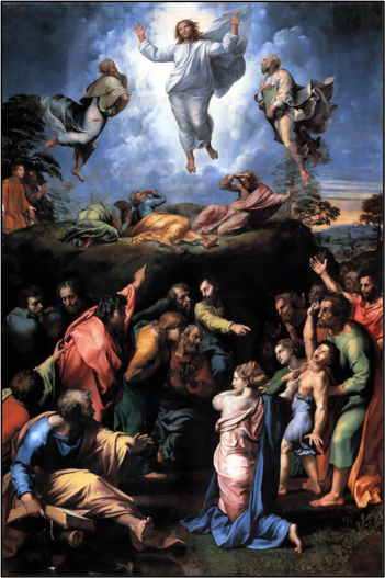
Raphael Raphael's last painting may very well be his greatest. It was completed in 1520 just before his death at the age of 37. In it we see Jesus hovering just above the surface of the earth. He is flanked by Moses and Elijah who join Him in His resplendent glory as Peter, James, and John look on. The setting is transcendent and beautiful and amazing and glorious. But it is only part of the painting. The lower half of this same painting depicts a scene of utter chaos. Toward the right is a demon-possessed boy. His eyes are rolled back and he is convulsing. He, too, is flanked by two figures, but they are not Moses and Elijah. Instead, they are the personifications of the oppressing spirits who defiantly stare down the other disciples. The followers of Jesus are flustered and unsure. They're looking at each other, and pointing at each other, and throwing up their hands in complete frustration.

According to St. Mark's account of this story, both events—the transfiguration and the failed exorcism—are occurring at nearly the same time. It is almost as if Mount Tabor itself stands as a character in the larger story, as Raphael moves us from Shekinah glory at the "top" of the mountain to the confusing chaotic mayhem at the "base" of the same mountain. And, if I'm honest, it is a tension I see often in my own life:

Sunday morning gives way to Monday morning. The sublime is overwhelmed by frustration. Glory is devoured by trial.

And yet there is grace.

The Ascension

Lou Kaloger

13 Kaloger Dali


The painting on the left is The Ascension of Christ by Salvador Dali. It was completed in 1958 and it is part of the Pérez Simón Collection. I like it. In fact, I like it a lot. I like the crazy yellow "sunflower" shape in the center. I like the depiction of the angel gazing out from behind the glowing red clouds. I like the subtle reference to the Holy Spirit in the form of a dove. I especially like the way Dali positions Christ's body. In many ways it is the counterpart to Dali's Christ of Saint John of the Cross painted a few years before. In Christ of Saint John of the Cross, Jesus is portrayed from the viewpoint of the Father. In The Ascension of Christ, Jesus is portrayed from the viewpoint of the disciples. One is a portrait of humiliation. The other painting is a portrait of exaltation. Both are crucial to redemption.

The other thing I like about The Ascension painting is the perspective. It's all wrong: it bends and it twists. Jesus is going up at one angle, the big yellow "sunflower" shape is at a second angle, the angelic figure is moving at a third, and the Holy Spirit in the form of a dove is at a fourth. What's not being portrayed is a linear trajectory from the earth to sky. What's not being portrayed is the notion of a heaven that is far away and at the other side of the universe. Rather, I'm given a portrait of something that is strangely closer than I might first think.   

It's funny. As I read in the first chapter of Paul's letter to the Ephesians, I see language that is similar. I'm told that the Father "raised Christ from the dead" and "seated Him at His right hand in the heavenly realms." At the same time, I'm told that I too am "raised with Christ" and seated with Him in this same spot. It's not that earth is "here" and heaven is way over "there." Instead, Christ is revealed as the point of contact between two worlds and I am again given a portrait of something that is strangely closer than I might first think.

Not some day, but presently. Not eventually, but now. And then something happens. Something small, and minor, And trifling, and trivial, And immediate, and silly. And I forget Dali's painting. And I forget Paul's words. And I forget where I am.

The Beauty of Obstructions

Lou Kaloger

Kaloger copy In 1967, Danish filmmaker Jørgen Leth wrote and directed a 12-minute experimental art film. The name of the film was The Perfect Human. Like a lot of experimental art films from the 1960s, The Perfect Human was quirky collection of black-and-white images accompanied by a minimalistic soundtrack and a odd voiceover. The voiceover said:  

Here is the human. Here is the perfect human. This is what an ear looks like. This is what a eye looks like. This is the perfect human shaving. This is the perfect human putting on a bow tie. This is the perfect human eating. This is the perfect human dancing.

Okay, it was no Crime and Punishment.

In 2003, director Lars von Trier collaborated with Leth on a film he titled The Five Obstructions. As the film opens, von Trier announces to Leth that he wants him remake his 12-minute movie with specific "obstructions" that von Trier will supply. Leth agrees. For one version, von Trier tells Leth to make the movie in Cuba but to allow no shot to last for more than a half a second. Leth argues that the film will look "awful and disjointed." Von Trier insists and the film is made. For another version, von Trier insists that the film be made in the streets of India with Leth playing the role of the lead character. Leth protests, explaining that he doesn't want to serve as both actor and director. Again, von Trier insists and the film is made. For yet another version of the film, von Trier tells Leth to remake the movie as an animated film. Leth confesses that he hates animated films. Von Trier insists and Leth makes his cartoon.

Interestingly, in the next scenario, von Trier tells Leth to do whatever he wishes. Leth jumps at the chance. He picks an exotic location in Brussels and shoots his film in a widescreen format. It is fancy and expensive and full of clever split-screen effects. The net result is a cross between a James Bond movie and a luxury car commercial.

So here are four films: Three with limitations and one without.

Guess which was the weakest of the four?

For some reason, von Trier's obstructions and limitations birthed something in Leth's art that was not there when Leth was left to choose as he chose. I'm not sure I want to say this, but I think the same may be true in life. God speaks, and what he says is rarely to my liking. He calls me to a certain constraint; he calls me to a certain love. Given free reign, I'm sure I would choose differently. But hey, that's the price one pays for art!

Behold the Man

Lou Kaloger

13 Behold the Man In 1999, Mark Wallinger created a statue of Christ wearing a crown of thorns. He named the statue Ecce Homo ("Behold the Man"). It was not chipped out of stone or carved out of wood, but was instead made out of a plaster-and-marble-powder cast of a human body. The piece was a temporary installation that stood on the empty "fourth plinth" in Trafalgar Square in central London. Being made from a human cast, it was literally life-sized and dwarfed by the imposing surroundings of the square.

I wonder what is was like to walk by that statue. Men and women on cell phones. Students rushing to class. Tourists asking for directions. Hot dog vendors and souvenir peddlers pushing their wares. People hurrying by. And there, in the midst of it all was that small, lone, unimposing figure of Christ standing on his enormous plinth.

Ordinary, modest, and ignored.

We live in a world of breathtaking beauty, complexity, and design. A world with pain, yet at the same time, a world of drama and purpose and subtlety and joy. A world created by, and now being recreated by the redemptive work of the God-man who walked the earth. So will I pray with my eyes open or will I simply busy myself with the cares of the day?

Cameras and Community

Lou Kaloger

13 Kaloger Camera In the spring of 2006, a crew of 400 volunteers converted the inside of a rented F-18 aircraft hanger into a working camera. The shutter was the size of a pinhole. The film was a 3,375-square-foot-emulsion-coated canvas that covered the entire back wall. The photo consisted of everything that could be seen outside the front door of the hanger. Everything. Once exposed, the film was developed in an Olympic-sized-swimming-pool liner. The net result was a landscape photograph that was three stories high and eleven stories wide. The unprecedented achievement was celebrated by holding a reception for the entire volunteer crew in the camera!

I sometimes think about that camera when I'm worshiping in church. To begin to understand the depths and riches and wonders of our God, to capture a sense of Him, to reflect and represent Him, takes something larger than me or you. It takes community. It takes people with different experiences. It takes people with different tastes. It even takes people I might not normally hang out with. People who are more staid and traditional than I am. People who are more audacious and expressive. Presbyterians and Pentecostals. Methodists and Mennonites. Congregationalists and Catholics. To begin to reflect and represent the depths and riches and wonders of God takes a worshiping community. It even takes sermons I would rather not hear, and music that rubs me the wrong way, and liturgies that do not line up with my immediate preferences.

Or maybe I'll just stay home and fiddle with my iPhone camera.

Spatial Concepts

Lou Kaloger

13 spatial concepts

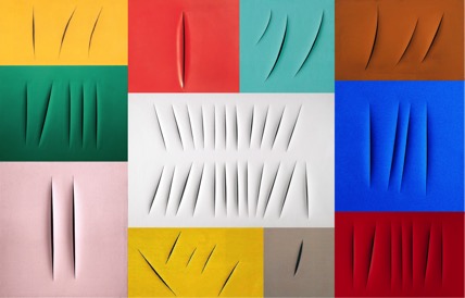
In the late 1940s, Lucio Fontana (1899-1968) took a knife and slashed a canvas that had been painted in a solid color. He called the piece Spatial Concept. Over the next two decades, Fontana produced a large number of similarly-slashed and similarly-titled works in a wide variety of sizes and colors. One of his last pieces was produced in 1964. It was white and contained twenty-three slashes. In February of this year, it sold for over $12.4 million.

Fontana's work was not without forethought and purpose. By relieving the canvas of its tautness, he sought to smudge the lines between two- and three-dimensional art and grant the surface a distinctively sculptural quality. In this sense, his Spatial Concepts seemed to stand as a protest against traditional art, particularly the work of Flemish still-life artists. After all, the depth, texture, light, and perspective of a Flemish still life is artificial. It is an illusion created by fooling the eye through technique.

The space depicted in Fontana's work can be measured. The space depicted in a Flemish still life is just a story.

Or so it seems.

Fontana's slashed canvases may have been "accurate," but the stories told by these Flemish still lifes said infinitely more. Many were chronicles of an individual's life summed up in the artifacts he or she owned. The best of them almost always included a memento mori. These "mementos of our morality" might be presented in the form of a bleached skull, a diminishing hourglass, a half-eaten apple, or an extinguished candle. Each served as a vivid reminder that the story of life is told best when we remember that we are but a vapor called to abide in the One who is from the beginning.

I guess that's the power of all good stories: Sentences with nouns and verbs. Rich imagery and tumbling metaphors. Stories about people, and places, and circumstances. People different from us, but also people a lot like us. Good stories measure.

Will I find myself in that story?

Believe

Lou Kaloger

13 Believe A few years ago, in an effort to drum up some American business, the French advertising agency Soleil Noir came up with a promotional campaign. They called the campaign "Believe" and it opened with these words: "In 2012 if you don't believe you won't make it happen."

Believe in fashion. Believe in health. Believe in work. Believe in entertainment. Believe in your ideas. Believe in yourself.

Believe.

Very early in the history of the church, shortly after a time of persecution, bishops, priests, monks, and theologians gathered together to formulate a very different list of beliefs. Historians speak of these churchmen as a motley crew. Many came with severed limbs, gouged eyes, and marred faces from torment they had endured for the faith. The document born out of this council came to be known as the Nicene Creed. We recite it to this day:

We believe in one God, the Father Almighty, Maker of heaven and earth, And of all things visible and invisible. And in one Lord Jesus Christ, The only-begotten Son of God, Begotten of the Father before all worlds; God of God, Light of Light, Very God of very God; Begotten, not made, Being of one substance with the Father, By whom all things were made…

So, I wonder about the competing creeds in my life. After all, each creed compels me to stop, and to reorient, and to catch my breath, and to get my bearings, and to rediscover where "north" is located.

But not all creeds are the same.

Which is winning?

Which is dying?


Thirty Are Better Than One

Lou Kaloger

16 thirty are better than one In 1963, Andy Warhol silkscreened thirty back-and-white images of Leonardo da Vinci’s Mona Lisa onto a canvas. The work was less than perfect. Any t-shirt printer will tell you that Warhol’s squeegee angle was sloppy, his ink application was inconsistent, and his registration was a mess. Since there were thirty “Mona Lisas,” Warhol named the piece Thirty are Better Than One.

So what does it mean? It's hard to tell. Warhol was always horribly enigmatic and rarely answered questions directly. When he did answer a question, he often seemed to be alluding to a joke no one else was in on. So what might we say about this piece? Well, we might say that Warhol was right—thirty are better than one. At least sort of.

When I was growing up in the 1960s, our country was in the middle of the space race. In school, we would talk about the future and it all sounded so cool. We would talk about how we would be able to take vacations on the moon, and how we would all own flying cars, and how we would all have our own personal robot, and how our television sets would have maybe as many as ten channels! (I remember saying, “Ten channels? No way!”). We would also talk about being able to instantly get our meals from a single mass-produced pill. So with all the 10-year-old humor we could muster up, we would pretend we were taking one of those pills, and say things like, “My, my this steak dinner is delicious!"

But a mass-produced pill is not the same as a meal. And eating is not the same as savoring. And hearing is not the same as listening. And looking is not the same as seeing. And thirty Mona Lisas are not better than one.

All art is wonderfully derivative

Lou Kaloger

Untitled In 1969, California-based artist John Baldessari and his friend George Nicolaidis took a stroll through the city. While walking, Baldessari shot photographs of Nicolaidis pointing at things. On the surface the objects seemed random and rather ordinary, but they were items both the photographer and the one pointing found interesting. The film was developed and 35mm slides were distributed to fourteen amateur painters whose work Baldessari had seen at regional art fairs. The painters were instructed to faithfully copy the photographs. Baldessari then added captions identifying the painters' names. The fourteen works were exhibited in Los Angeles and New York under a series titled The Commissioned Paintings (1970).

So here's my question: Who is the artist? Is it Nicolaidis who pointed? Is it Baldessari who snapped the pictures? Is it the fourteen amateur artists who painted? Or are we the artist for assigning meaning (or disdain) to these works?

I am not suggesting this is great art, but I am asserting that creativity is inescapably collaborative. This is true even when we work alone. Even when we work alone we are in constant dialogue with others: Those that came before us, those that are part of our present culture, even those who will follow. The works is ours, but at the same time it is not.

All art is wonderfully derivative. All art is wonderfully unoriginal. All art is wonderfully borrowed.

So let me borrow from Dietrich Bonhoeffer: "Let he who is not in community beware of being alone."

I think this is a metaphor.

Lou Kaloger

Untitled In the winter quarter of my junior year of college, I convinced my roommates to run away from school. It was 1973 and I was nineteen years old. We drove from Bowling Green, Ohio to Chicago, and after three days of feeding our stomachs with deep-dish pizza and 3.2 beer it seemed right to feed our souls with a trip to the Art Institute of Chicago. We wandered from one gallery to the next, when we stumbled upon a special exhibit featuring the works of contemporary artists. On a far wall was a massive painting of the head of an attractive woman. It was by the American artist, Chuck Close and it was unlike anything I had ever seen.

The painting was highly detailed. I would later learn that most of Close's work from this period was painted in a style called Photorealism. I walked closer. The woman who looked attractive from a distance began to change. Her lips were cracked. Her skin was a bit wrinkled and greasy. I could see open pores, and split ends, and caked makeup. I kept walking closer. I stood in front of the wall-sized painting. Everything was now massive —the cracked lips, the wrinkles, the open pores, the split ends. But I also noticed something else. It was an unexpected beauty. A complexity, and a depth, and a sense of design.

I turned to one of my roommates and said, "I think this is a metaphor."

I too am a jackass

Lou Kaloger

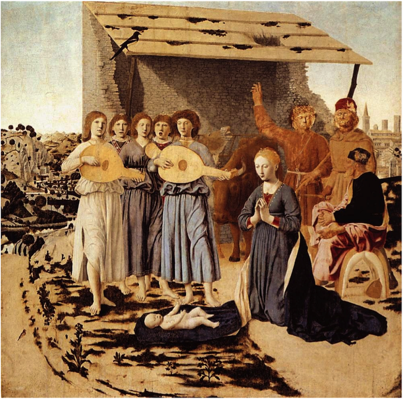
Untitled My favorite nativity painting is this piece by Piero della Francesca. It was completed around 1483, long after the larger inventory of the artist's catalog. It is painted with oils on a panel of wood and, like Piero's other works, it shows the artist's meticulous attention to perspective and composition. The painting is currently on display at the National Gallery in London but many believe the artist intended to have it hang in his family chapel near his tomb.

I love every part of this painting: the singing angels, the silent magpie, the fragile child, the contemplative virgin, the pensive ox, the storytelling shepherds—even the strangely casual portrait of Joseph who nonchalantly crosses his legs as he rests on a saddle. But my favorite part of the painting is the jackass in the center. He was once just an ordinary jackass, but today, with exuberant joy and unexpected privilege, he sings with angels!

And I think of my own life. And I realize that I too am a jackass who, by the grace of God, gets to sing with angels. And I like that.

But Sunday morning becomes Monday. So what will I do with that song?

Worried about your camel?

Lou Kaloger

Untitled In the city of Padua stands a church; it's called the Scrovegni Chapel. From the outside the church is not much to look at but the inside is another matter altogether. Every interior wall of the chapel is covered with richly colored frescos. The frescos are the work of the Florentine master Giotto di Bondone. Together they tell the story of Christ.

The most famous fresco in the chapel is The Kiss of Judas, but my favorite is The Adoration of the Magi. I stare at the painting. I think of the magi on his knees, deeply worshiping as he kisses the feet of the baby Jesus. I think of the other two magi, clutching their gifts as they patiently wait their turns. I think of Mary and Joseph taking it all in, marveling that men would travel so far for an infant so small. And then there's the young attendant at the far left. Do you see him?

The invisible has become visible.

The infinite has become finite.

The Word has become flesh.

The resplendent miracle of God is in the arms of a virgin, yet it all goes unnoticed for a man worried about his camel.

Man of Sorrows

Lou Kaloger

Dyce

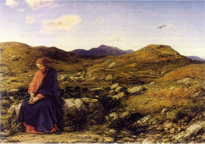
The painting you are looking at was completed in 1860 by the 19th-century Scottish artist William Dyce. It is called "Man of Sorrows." I think it's an odd painting, though on the surface it does not seem that odd. Without the title we might think it is a painting of Jesus in the wilderness or perhaps in the Garden of Gethsemane. But the title tells us something different. The phrase “Man of Sorrows” comes from Isaiah 53:3 ("He was despised and rejected by men, a man of sorrows, and familiar with suffering. Like one from whom men hide their faces he was despised, and we esteemed him not.")

An internet search of this phrase shows us that “Man of Sorrows” paintings were commonplace during the Middle Ages. They were portraits of the scourged and wounded Jesus at the point of his humiliation, displaying the marks of crucifixion on his hands and side. Dyce's painting, however, looks nothing like this. Instead it depicts a unwounded Christ sitting on a rock. And yet, it is a portrait of a Christ who is clearly saddened. So how are we to interpret this painting?

It appears that part of the interpretation of this painting lies in our understanding that the landscape Dyce is depicting is not 1st-century Palestine. The landscape Dyce is depicting is the countryside of 19th-century Scotland. Christ arrives, but he is ignored. He is scourged, but not by whips and beatings. Instead, for Dyce he is scourged by indifference and apathy. He is the “unesteemed” Man of Sorrows. So I look at that painting and I’m ready to move on. But then I imagine for a moment: What if the landscape depicted by Dyce was not the countryside of 19th-century Scotland? What if it was someplace from the 21st century? What if it was my city? What if it was my neighborhood? What if it was my home?

There's something insulting about this . . .

Lou Kaloger

Untitled

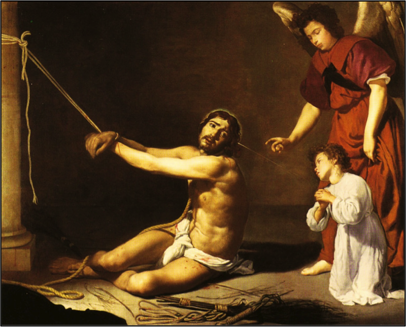
A painting hangs in Room 30 of the National Gallery in London. It’s by the 17th-century Spanish artist Diego Velázquez (1599-1660). The title of the painting is a bit of a mouthful. It is called Christ After the Flagellation Contemplated by the Christian Soul. The painting depicts a scourged Christ still tied to his whipping post, an angel wearing a red robe, and a kneeling child dressed in white. If you look closely you can also see a thin beam of light traveling from Christ to the child. It is an unusual painting. It’s not unusual because Velazquez depicted a beaten Christ—plenty of artists had done that. No, what makes this painting unusual is the strange title and the presence of the young child. So we look at the painting, and we wonder, and it doesn’t take long to realize that the child and the “Christian soul” are one in the same. And what of the attending angel? It’s interesting that the attending angel is not attending to Christ but is instead watching over the Christian soul personified as the child.So what is Velazquez saying? Well, the best I can tell, the child is us. We’re the ones who are weak, we’re the ones who are broken, we’re the ones in need of comfort. Is that the meaning of the beam of light? Is the beam of light a symbol of Christ’s comfort and grace and righteousness offered us, even at the time of his greatest trial?

I suppose there’s something insulting about the entire scene. We like to believe that we are strong, and that we have it together, and that our need is one of, perhaps, some fine tuning to smooth out a couple of our rough edges but hardly more than that. At our worst we might even be tempted to think that Jesus is pretty “lucky” to have us. But is that the portrait we see, either here in Velazquez’s painting or in the pages of Scripture?

Is it art?

Lou Kaloger

13 john-baldessari-the-pencil-story-1972

There's an American artist; his name is John Baldessari. In 1973 he mounted two photographs of a pencil on a board. Beneath these photographs is his hand-lettered story of this pencil. So I look at this work and I wonder how it ever made its way into a gallery. It’s certainly no Mona Lisa; it’s definitely no Sistine Ceiling. Is it art? I’m not sure. I suppose if it is art it is because Baldessari causes us to reflect (at least for a moment) on the actual nature of art. Art expresses skill, and art expresses emotion, but art also reflects change. Clay is molded, wood is carved, stone is chiseled, words are arranged, a pencil is sharpened. Something rough is made into something more beautiful, or more useful, or more provocative, or all the above. Art speaks of transformation and sacrifice. Even the dull pencil had to give up something. Did it hurt? Probably.

So I think of our own lives. I wonder what it means when Paul writes, “For we are God’s masterpiece, created us anew in Christ Jesus so we can do the good things he planned for us long ago” (Eph 2:10). Though we are guarded and defensive our God remains willing to mess with us. He is even willing to use others to mess with us. Something rough is made into something more beautiful, or more useful, or more provocative, or all the above. At least that’s the plan. Will it hurt? Probably.